Your App Works. But Does It Feel Alive?
You open two apps. Both load fast. Both have the same features. One you use every day. The other one you deleted by week two.
The difference? You probably can’t explain it. But a UI designer can.
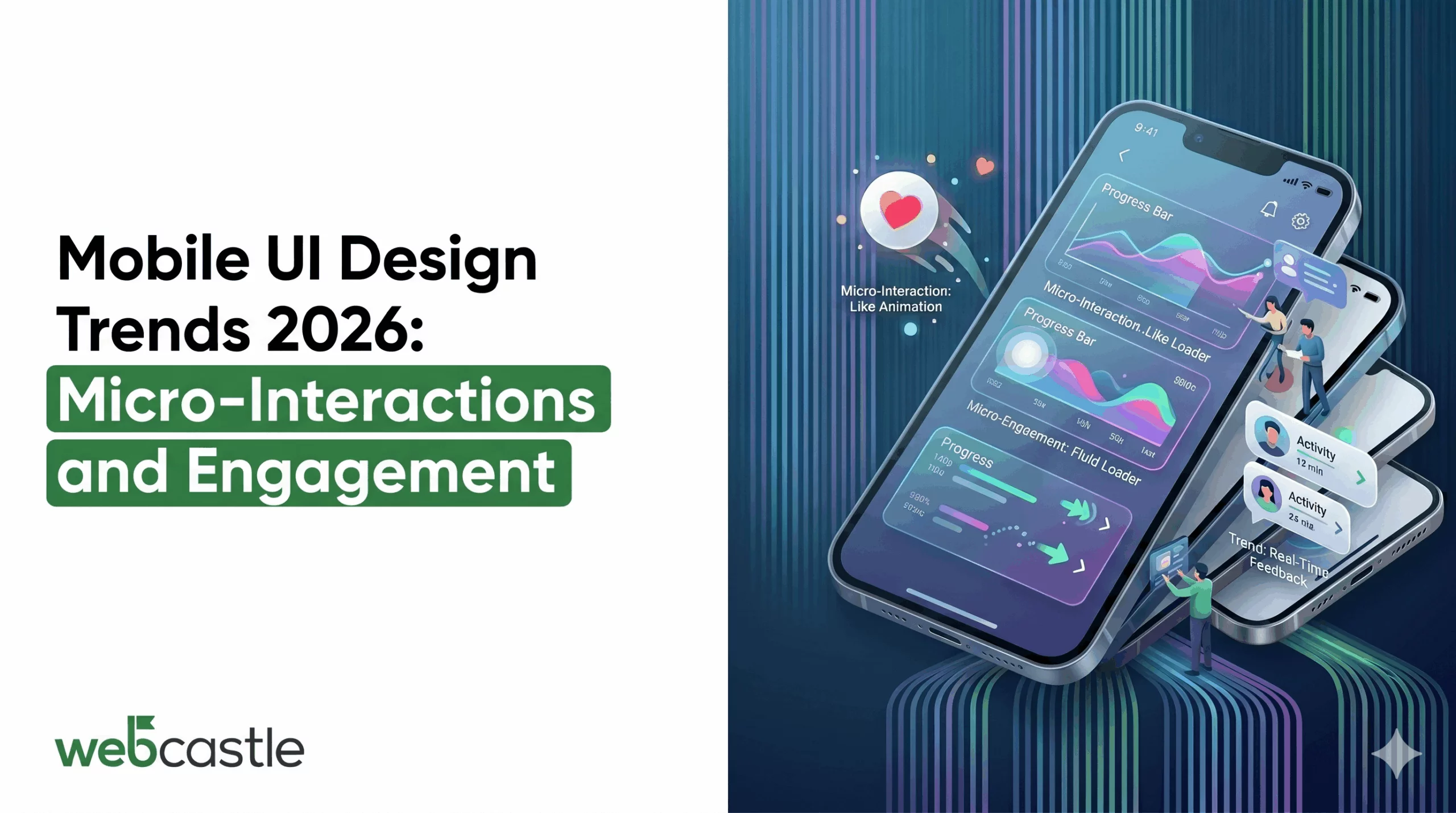
It comes down to micro-interactions — those split-second responses when you tap a button, swipe a card, or pull to refresh. In 2026, they will no longer be optional polish. They are the baseline.
The Real Problem: Apps That Do Not Respond Like a Human Would
Here is a friction point most product teams miss.
When a user taps a button, and nothing visibly confirms that tap — no animation, no color shift, no vibration — the brain registers uncertainty. Did it work? Should I tap again? That half-second of doubt is a crack in trust. And cracks accumulate.
This is where mobile app UI design trends in 2026 are doing the real work. It is about whether your app communicates back to the user in a way that feels human.
The 2026 Trends That Actually Fix the Friction
1. Haptic Feedback Integration: The Sense You Forgot to Design For
Touch screens have no texture. They are flat glass. Haptic feedback integration is the workaround that makes digital interaction feel physical.
What this fixes in the user journey:
- Users who miss a visual confirmation now feel it
- Form errors become impossible to ignore
- Swipe-to-delete actions feel intentional, not accidental
2. Dark Mode Optimization: Stop Treating It Like a Color Swap
Dark mode is not an accessibility toggle anymore.
Most teams implement dark mode by inverting their light palette. That is wrong. True dark mode optimization means:
- Using true black (#000000) only on OLED screens, where it kills pixels and saves battery
- Using dark gray (#121212 or similar) for standard screens to avoid “black hole” depth issues
- Testing contrast ratios in isolation — colors that look WCAG AA in light mode tend to fail on dark background
- Rethinking the use of shadows (shadows become invisible against black backgrounds; opt for very subtle glows or borders). Done right, dark mode is more about a visual hierarchy than anything else
3. Wearable Navigation: Less Chrome, More Content
The bottom bar and hamburger menu are not dead. Instead, they are being replaced with swiping gestures, long pressing, and edge-based navigation. Every pixel used for navigation chrome is a pixel taken away from content. Gesture-based navigation reclaims that space.
The friction point it solves: users who are deep in a workflow — say, editing a photo or filling a multi-step form — should not have to exit to a nav bar to move forward or back. The gesture should be contextual and available from wherever they are.
The risk here is discoverability. If users cannot find the gesture, it does not exist for them. The solution is onboarding — a single-run tutorial that shows gestures in context, not a wall of instructions on a welcome screen.
4. Visual Hierarchy That Guides, Not Decorates
In 2026, visual hierarchy is being used less as a design principle and more like a conversion tool. Teams are asking a different question now: “Does this seem balanced to you? But does the user eye fall where the action is?” Examples of good, strong visual hierarchy in 2026:
- Size and weight contrast (not just color) to establish primary vs. secondary actions
- Whitespace as a deliberate tool, not leftover space
- Motion to direct attention — an element that animates in becomes the focus
5. Mobile Typography: The Detail That Signals Quality
Bad mobile typography is invisible to most users. But it creates friction they feel without understanding why.
In 2026, the focus is on:
- Variable fonts — single font files that adjust weight and width dynamically, reducing load time while enabling richer typographic expression
- Minimum 16px body text — anything smaller causes micro-adjustments in reading posture that build fatigue
- Line length control — 60 to 75 characters per line is optimal for readability; mobile screens force designers to be intentional about this
- Contrast over creativity — a beautiful display font that fails contrast ratio tests is a liability, not an asset
Typography is the one element users cannot ignore. Every word in your app passes through it.
This Is Not a Design Problem. It Is a Business Problem.
User drop-off between install and first meaningful action — what the industry calls “activation” — is where most apps bleed users. And the majority of activation failures are not product gaps. They are UX friction points.
Micro-interactions address these friction points at the moment of contact. They are the difference between an app that feels trustworthy and one that feels uncertain.
The best mobile app development Boston teams are not just building features in 2026. They are building feedback systems — interfaces that respond, confirm, guide, and reassure at every step.
Ready to Build an App That Users Actually Keep?
If you are planning a mobile app — or looking at why your current one is underperforming — the answer is rarely “add more features.” It is almost always “reduce the friction your users are silently navigating.”
WebCastle, recognized as the best mobile app development company in Boston, builds mobile experiences that go beyond functional. Our team focuses on the moments between the taps — the feedback, the transitions, the visual logic that keeps users oriented and engaged.
With over 1,000 projects delivered and 16+ years of global experience behind every Boston build, we know where apps fail users before the data shows it.
Tell us what you are building. We will tell you what it actually needs.
